UGA Hacks
What I Did
Industry
Non-Profit
Description
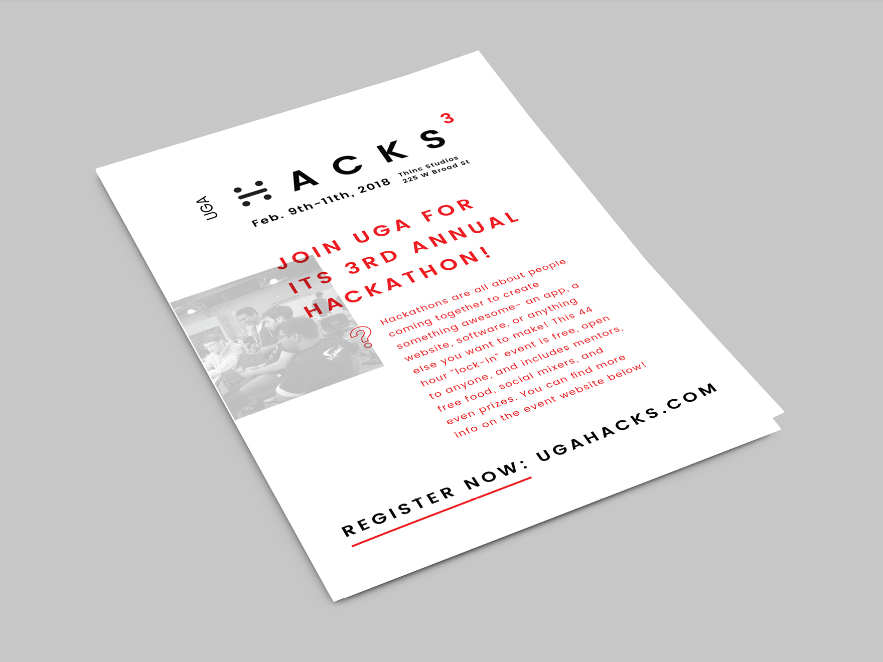
I created the visual identity and all supporting materials for the 3rd annual University of Georgia Hackathon event (UGA Hacks). The goal that year was to get back to the basics, with a heavy emphasis on recruiting first-time attendees. To support this, I chose a primarily black-and-white color scheme, ensuring the information was the clear focus. Red accents were applied to draw attention to important content as well as contribute to visual interest.
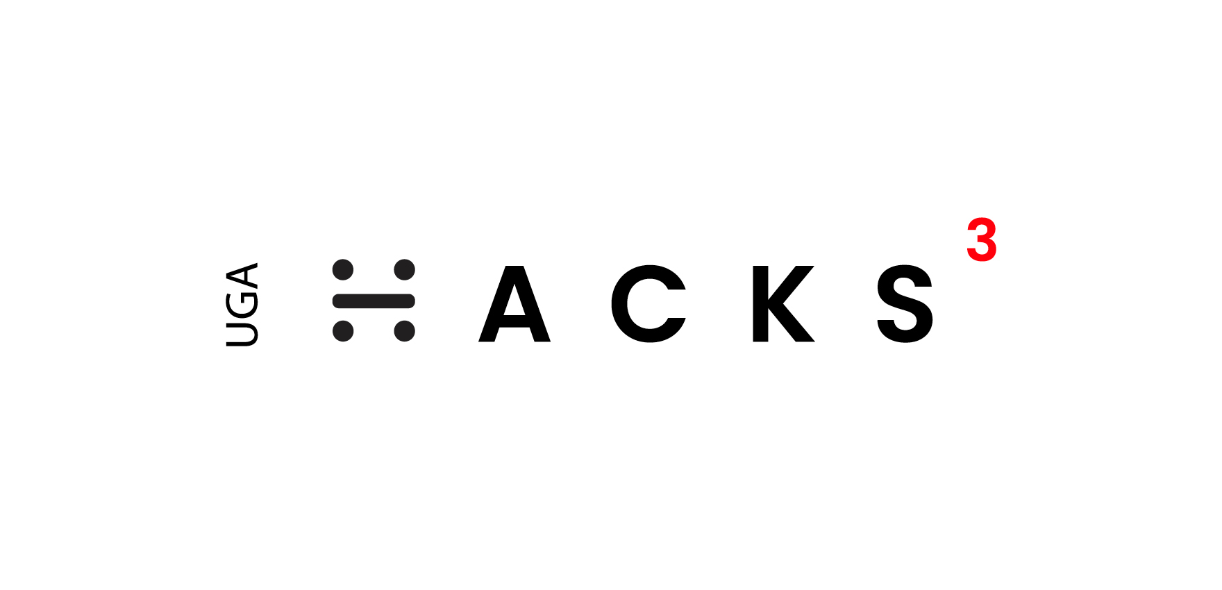
The logo mark was designed to convey the fundamentals- collaborating with others over a weekend to make something awesome. The four circles make up a team, with the bar in the middle becoming their workspace.
The website was redesigned with first-timers in mind, providing clear information and guiding them through the signup process. The use of icons to reinforce concepts, the addition of an expandable FAQ’s section, and other such details were all made to help newcomers feel welcome.
To ensure they stood out easily from the crowd, volunteers wore red while participants wore white. Special lanyards were also designed for each role, with participants’ lanyards doubling as a check-in system to make it easier for the volunteers.
In addition, a revamped sponsorship guide was created- streamlining the various sponsorship levels and clarifying what incentives were provided at each tier.
As a result of all these efforts, UGA Hacks saw a 50% increase in UGA student attendance that year and a 25% increase in attendance overall.