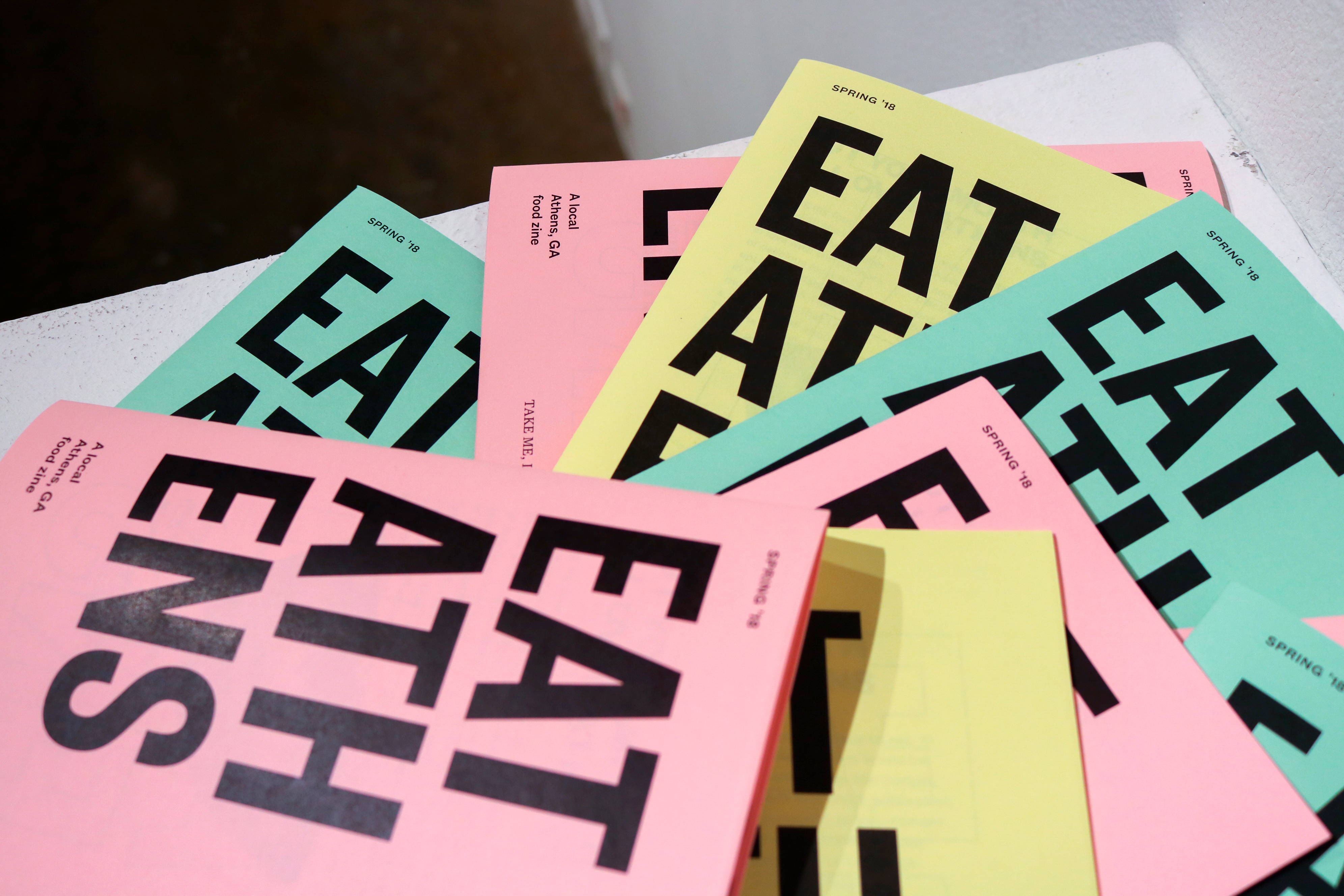
Eat Athens

For my exit show, I decided to tackle an issue near and dear to my heart. The Athens local food scene had been such a distinct and integral part of my college experience at UGA, and yet many students do not have an accessible way of learning more about it outside of static review sites like yelp or google reviews that only give barebones information without communicating the local flare that makes it worth exploring.

Platform

In addressing this issue, I needed to create a solution that provided the basic information people need to know in an accessible, quick way, but also provide further details that rewards extended engagement with the material. I also wanted to avoid a focus on user interaction/involvement in favor of providing authoritative information based on my own personal experience. After doing a lot of research about the way consumers find and decide on new restaurants, I decided on a print solution instead of my original intentions of creating a digital platform. This decision would also ensure the content felt more personal and low brow.

Material

When designing the look and feel of the publication, I wanted to emphasize the low budget ephemeral expectations that would accompany a zine series run by a college student. This would resonate with my target audience of other college students more than a high-budget elegant design. It would also ensure costs would be low enough for me to continue to produce the publication regularly (probably every semester) and in high volumes. This would result in more students getting regular access to the information.

Execution

A low budget approach called for black and white brutalist design on low-quality paper with saddle stitch binding. I used a variety of bright paper colors to allude to low budget flyers- further emphasizing the importance of the content over the presentation. This would also help increase brand recognition across campus, brightly contrasting whatever environment the zines were placed in.

Spreads

The zine contained rundowns on local restaurants, spotlighted special dishes, provided interviews with chefs and business owners, as well as highlighted deals for students to take advantage of. All of this was delivered in an irreverent, tongue-in-cheek manner in order to be engaging instead of purely informational. Examples can be seen below in their full-color variation.