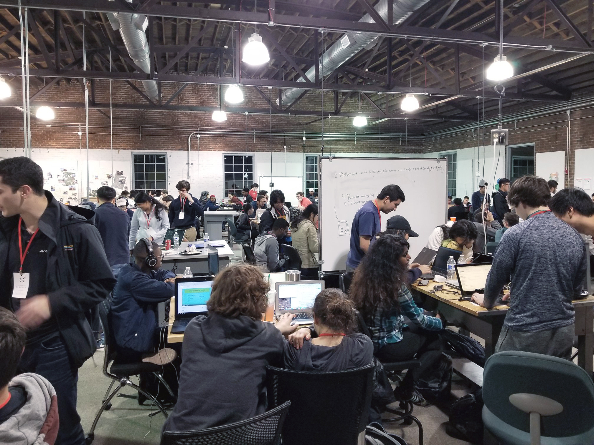
UGA Hacks
This brand identity was created for the 3rd annual University of Georgia hackathon- UGA Hacks. The goal that year was to focus on what a hackathon is all about in order to better engage and educate the population of students that had never attended one. Because of this, I chose a primarily black and white color scheme to ensure the information itself was the main focus throughout the brand. Red accents were applied sparingly to highlight important content and create visual interest.
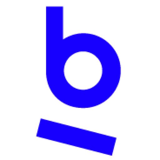
Logo
The logo mark was designed to convey the fundamental experience of being at a hackathon- collaborating with others to make something awesome. The four circles are the hackers that make up a team, and the bar is the table that becomes their workspace.

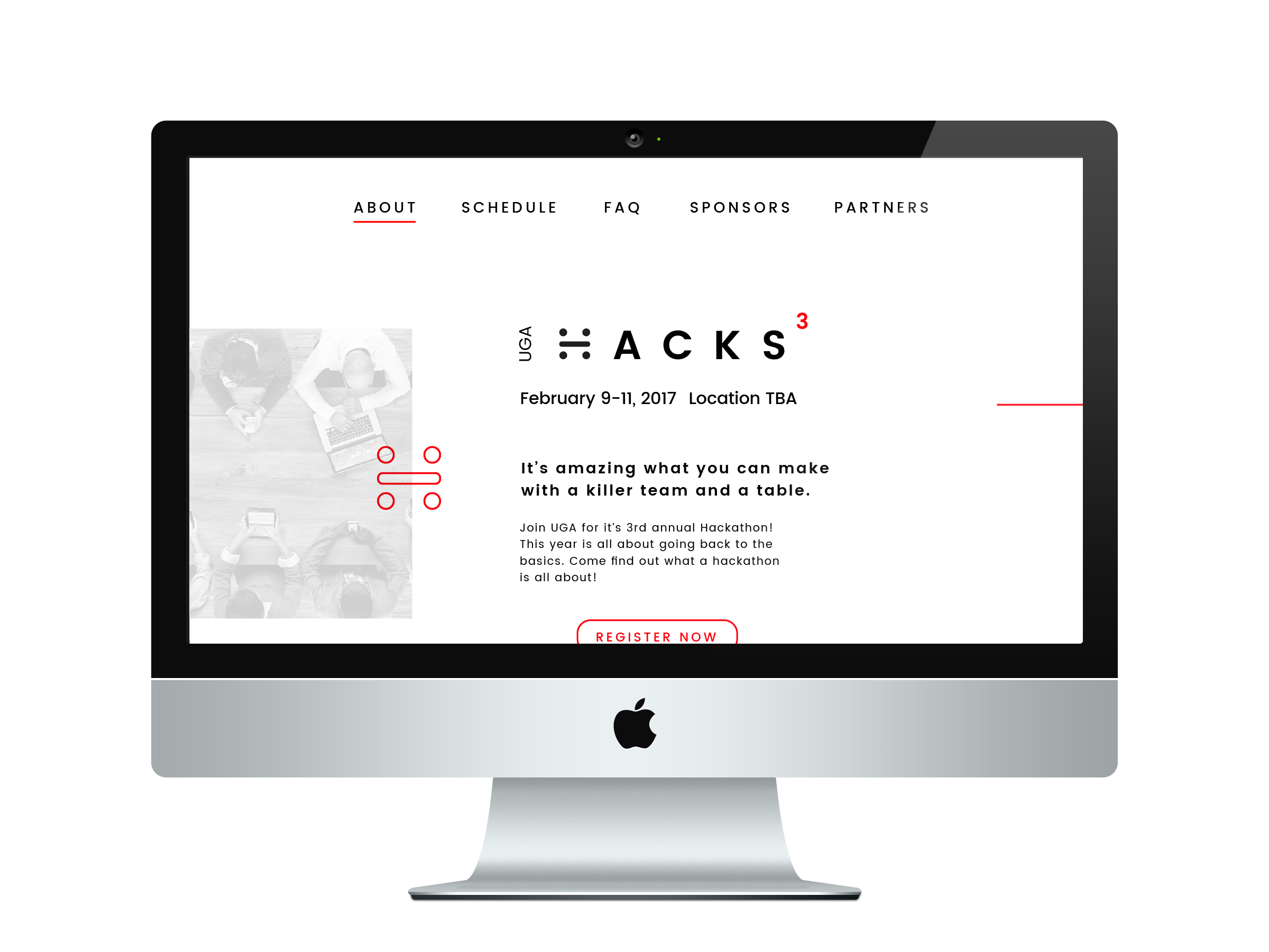
Website
The website was designed with first-timers in mind, making sure to help them learn about the event and sign up for it as quickly and efficiently as possible. Decisions like the use of icons to reinforce concepts and an expandable FAQ’s section were all made to help students feel prepared and excited to attend a hackathon, even if it was their first one.

Promotion
Flyers were created and handed out in classrooms to help get the word
out about the event.

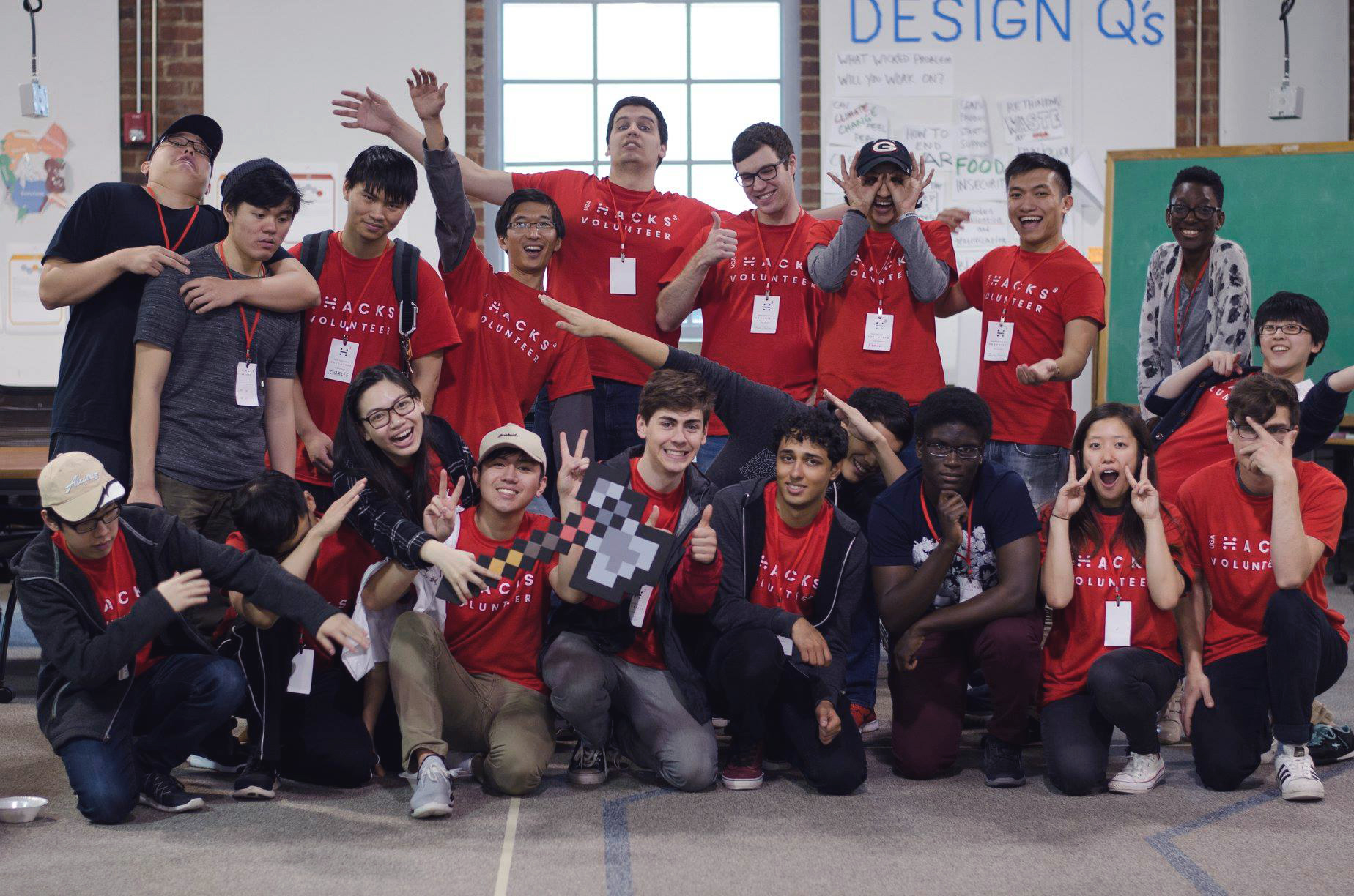
Shirt
Volunteers wore red shirts to stand out easily in a crowd, ensuring anyone with questions would have easy access to someone with answers. At the end of the event, participants received a white shirt with the logomark on the front in order to further solidify the brand in their mind and help UGA Hacks raise awareness on campus.


Results
That year, UGA Hacks saw a 50% increase in UGA student attendance
and a 25% increase overall.